Sunday 31 January 2010

Some more concept art

Been mostly sorting out my tax return this past week so there hasn't been too much time on this thing, but I have done a few more doodles.


I get the feeling I should watch Beowulf at some point

Knowing I have a general habit of coming up with one character design and more or less going with it (it comes from a job where you don't have time to waste on concepts), I decided to have a crack at some various designs, although they generally stuck to the beardy muscly variety, with the exception of the top left, which is influenced a little by Kratos from the God of War videogames. For the muscly designs, I tried thinking about how I can compose the dudes out of various shapes, mainly triangles and squares.

When thinking about the epic battle montage (what I may do is just produce one or two 30 second animations for the contest brief, then use the remainding time to make a full version for uni), one of the things that popped into my mind was the opening one and a half minutes of the ever-so infamous episode of the Super Mario World cartoon, Mama Luigi.


With 'Fire Sumo' fresh in my mind, I thought to myself, 'hey, there should BE a fire sumo'. Who's gonna make the connection? >_>

Fire SUMO!!!

So what you basically have is what it says on the tin, er, paper. A sumo, that's on fire. I drew it out with my fancy felt pens, starting with the orange outline, throwing in some yellow shade, then some more orange shade and finished off with some red highlighting to bring out the outlines. Marvellous. If I do go with Fire Sumo, I may present his scene in a traditional Japanese style (ie. not anime, think more that BBC Promo from the 2008 Olympics).


Also feature, an idea for an iPod-based badnik that never really caught on.

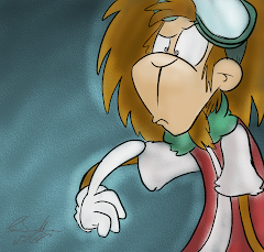
Since HMV sells its fair share of video games for sale, I figured it'd be fair game (sorry) to give that side some representation. When you think videogame nasties, a large number of people would most likely think of good ol' Dr Robotnik (aka Dr Eggman) from the Sonic games. And thus, came the creation of Professor Manegg, who represents the dark side of all things...erm egginess, sporting an easter-style pencil crayon face and a lil bread soldier sticking into his gooey insides. As well as the obvious Robotnik influence, I thought about the old-school videogame hero Dizzy, an egg who also sports red gloves and boots. This reference stuck out due to recently working on a Weebl series called '8 Bit Pwny Club', of which one of the characters also parodies Dizzy. I also drew up Professor Manegg in flash for the lulz.

The brown chequered background is a reference to Robotnik's ball of doom from Sonic 1.

Will post some more concept art, and maybe give a little thought into research, in the next post. Stay tuned!

Tuesday 26 January 2010

The idea that will happen

Whilst contemplating the idea of the clockkeeping mouse (note to self: learn to title stuff better), the tutors brought up the idea of submitting competition briefs for design awards, something everyone participated in last year for the D&AD Awards.

'Black Hole Sheep' - my animation for Motion Graphics. It didn't win the D&AD award.

With the tutor generally deciding this year's briefs for D&AD were rather crap, another source of competition briefs were shown via the YCN Student Awards. This had a more appealing range of briefs, ranging from Cartoon Network to Monster Munch (the latter of which is surprisingly enough to be targeted at 18-25s, for nostalgia and student munchies I guess?)
The one that struck a chord with me was HMV's brief in which participants had to design something to promote their supposedly easy to use website. As I thought about what I could include, I thought...ADVENTURE!


Before you ask, yes, I am completely bonkers.

The main pitch I had stuck in my head, which would be about 60 seconds in length, or two 30 second TV spots, was to have a brave warrior, the most clichéd money can buy, go on an epic quest, fighting all sorts of horrific demons and monsters from legend, fiction and my spur-of-the-moment attaching of adjectives, all to get that one thing who truly desires.

A Scrubs Season 7 Boxset (or whatever's the commercially hip product of the time of release).

That's when we kick in the narrator, who tells us that the alternative is to use HMV's website to get the latest DVDs, music and games delivered straight to your door instead, to which our hero responds with a daytime friendly alternative to 'FFFFFFFFFFFFFFFFFFFFUUUUUUUU-!!!'

Some concepts for the idea, featuring Mr Burly (we'll just call him that for now.)

I pretty much just started the concept artwork for this project right in the middle of everyone else presenting their idea pitches, but the general idea was to have this rather OTT viking type dude with bulging muscles, tight leather trouses, and an ultra sexy beard. The influences speak for themselves, but since we apparently have to go about 'explaining' this stuff, they include Eddie Riggs from Brutal Legend, the Scotsman from Samurai Jack, Prometheus from Disney's Hercules, Gimli from Lord of the Rings, and more or less any large bearded person from a DC cartoon. Will look into over influences, as well as experiment with more designs, later on.

A fun aspect will be trying to come up with various threats that stand between our hero and his Zach Braff fix. It'd have 'parody' written all over it. Legends talk of a fierce dragon, I drew a fifty armed dragon. Those sirens Homer went against in Homer's Odysee? Let's remodel them into manufactured pop-sirens. The fearsome Black Knight of...y'know screw it, let's just throw in a Dragonball reference. And a giant killer octopus not good enough for ya? Three words.

RADIOACTIVE.
NINJA.
OCTOPUS.

Oh dear god, YES

Having pitched this idea as a back up for my clockkeeper idea, my tutor was quick to notice that I was a lot more enthusiastic about this kind of idea than the other one, to which the other students unanimously agreed. HMV ad it is then. And since I technically work in advertising (I do the occassional promotional tidbit as part of the Weebl's Stuff team), it'll be great experience. Naturally, there is that whole comfort zone thing to generally worry about, but I plan on going beyond the general use of flash, most likely implimenting the use of After Effects and Photoshop as well. I also recently downloaded some music creation software called FL Studio, so if I can figure the workings of that out, I might even be able to supply my own epic soundtrack instead of mooching off the various royalty free sources.

The flipside is that due to the competition's earlier deadline, I need to get the main beef of the animation completed by mid-March (the main module's deadline is in May), but it shouldn't be too much of an issue, as this is the kind of thing I'm good at, and I have a bit more motivation going for me. I know my general hope for this degree was to develop my skills into epic festival-short making proportions, but if I can apply the stuff I've learned into a kickass advert, that's bound to be a good push in the good ol career direction.

The idea that didn't happen

Okay, so following on from Rob Sprackling's talk, I got thinking about how I could put his advice to good work. Having heard his bit on creating a world and adding a contrasting element, and hearing one student say 'grandfather clock' I thought a contrast to a grandfather clock would be a digital LCD clock. So I thought about there being wise old mice living in a grandfather clock, who gets visited by LCD shaped aliens from a digital watch ship. My general thought was to keep it to one, elderly and probably lonely old mouse.

Mockup of Clockkeeper. Lineart in Photoshop, CG in Art Rage 2.

I thought of a mice for the main character since, as any fan of Hickory Dickory will tell you, clocks and mice go hand in hand. Influences for the character design above can attributed to typical kindly sage type people, as well as various animated mouse features such as An American Tail and The Tale of Desperaux. The staff thing can be attributed to many staff carrying people of all kinds, particularly ones with magic powers such as Mumbo's wand from Banjo Kazooie, and I think Clank uses one in Ratchet and Clank: A Crack in Time.

Quickie mock up drawn in Flash.

When it came to his alien friend, I took inspiration from LCD digits you find on alarm clocks, although the main issue came from trying to figure out a look that both represents this and would animate well. The most common design was a simple body and head piece, with blue backlight (inspired by my old digital watch) for its eyes and a number on its front. Not particularly sure what it would have been for, but it could've been used to show expression or, in the case of multiple ones, as an identifier. The general look is reminiscent of Eve from Wall-E, with a little touch of Mr. Game and Watch, the hero of various LCD games (this was also a type of animation I considered for it). A general problem would be how he would interact with things, since the cubic nature of the character is rather restrictive.


The main, and probably fatal, issue was trying to come up with a story that links the two characters together and gives it meaning. I was hoping to aim for one of those buddy movies much like the majority of Pixar animations (Wall-E, Up and Finding Nemo ring bells). One plot point I considered was for the mouse to have a grandson who was unfortunately killed by a mischievious cat, leading the elder mouse to become lonely, scared of the outside world and untrusting of others. His design is a little reminiscent of one of my own characters, Bunnycat, who like my other character, sports a pair of goggles, though his pair would be more fitting to the timeline.

When I showed this idea to my tutor, the idea of a grandfather clock scenario was well received, but there was general criticism over the necessity of the LCD alien, my inability to fixate on a story and the general overhyping of things (a problem that bit me in the butt during Date for One's production).

And that's when I showed them my other idea.

Wednesday 20 January 2010

Experimenty stuff, Rob Sprackling

After talking with one of my tutors, who also does a lot of flash stuff, I decided to try out some experimental animation tests.
First off, I tried a little rotoscope animation, mixed with some keyframe animation. Basically, tracing over my head as I make swift movements as a start, then keyframing various bits near the end for an original effect.


Next, I tried using live reference to try reference of my hand and mouth (which isn't easy when the only reflective thing in the room is a clock), and keyframing inbetween it, in a vain attempt to get better at hand and mouth drawing.


Next, I practised some morphing skills. Using a photo of MrSimon as reference, I traced over it, and then modified the drawing at each step, similar to how one could stretch Mario's face in Super Mario 64.


By the fourth experiment, I had more or less completely lost it. I took a picture of myself, drew over it and made me look like Dr Robotnik of all people, and then lipsynced it to a 'nutshell' audio clip.


So yeah, I hope to experiment with various different things. Question is, what?


Today, I went to a talk by Rob Sprackling, who wrote the screenplay for Mike Bassett: England Manager (he showed clips, it was funny shit) who was hosting a talk on how to write funny stuff. To my surprise, it was a lecture I was not only able to stay awake for, but took an active interest in.

He talked about how you go about generating original ideas, a skill this anime obsessed dork really needs. One of the key starting points he mentioned was to start off with a world for your idea, then throw in an element that clashes with that world. For example, for one of the movies he is writing, Gnomeo and Juliet, he's taken the world of cheeky garden gnomes and thrown in the total contrast of epic romance. This is proving to be an interesting starting point for coming up with ideas, as when the world of grandfather clocks were brought up, I silently thought something along the lines of digital watches representing an evolved alien species, an idea I may expand upon.

When talking about characters in funny films, he mentioned there will be one or two 3D characters that the story revolves around. This character would develop over the course of the film, learn something that changes his personality or something (a good example being Kuzco from The Emperor's New Groove, who goes from egotistic emperor, to caring friend.) Then, there are the one-joke characters, such as yes men, flawed geniuses and plain goofballs, who don't particularly need any long journeys or backstories, but have an impact on the central character which brings out his facets. (Like how an annoying character brings up the agitated side of someone).

Storywise, he said there should some self-contained stories in the movie, but mentions they should join with the other stories to keep the overall narrative flowing. One example that springs to mind is 'Phineas & Ferb', where the adventures of Perry the Platypus somehow end up effecting what Phineas and Ferb are doing.

He then talked about theme, where he said a film needs to be going somewhere and have something to say, a rule I generally break with my animations, since I just tend to focus on making it for the sake of making it. Lastly, he talked about how the structure should have a beginning, middle and an end, and that within the first 10 minutes of a film, you should have a good idea of what will happen in the last 10 minutes, give or take the twist in the middle.

All in all, it was an interesting talk, and I hope to gain something from it.

Thursday 14 January 2010

Date For One released!

Well, my movie's all done. Was going to make further additions, but I was just totally zoned out and anything I would've done seemed a bit forced, so I simply fixed up some small bits and called it a day.


Newgrounds: Vote 5 Please
DeviantArt: Here

Monday 11 January 2010

Almost Done

Anonymous guy and his hot date (left)

Took a lot out of me, but I've managed to get the animation more or less done. It's a little rushed towards the end, but it's at apoint where it should suffice for uni submission. After a few visual tweaks, I'll submit it to Youtube, Newgrounds, etc.

In the meantime, time for some last minute writing material.

Hot damn.

The above shot is one that I've been meaning to use ever since I thought of the idea of Date for One in 2007; the 'sex' scene. This is where the originality starts to shine through. Coming up with a good way of expressing this scene was a lil difficult, given my general inexperience in both lady wooing and mime arts as of late, but going with what's popular in artsy type films (ie. gross stuff), some breast groping and external tongue touching seemed to do the trick here.

In terms of the layout and colour scheme for this shot, I looked at a flash animation called 'Jerry' by Max Gilardi. It's a series of animations about a typical guy who does menial tasks all the time, goes to bed with a few ladies, has a generally rotten life and ends up hanging himself, as well as some of the characters around him, such as his Dad, his son and one of his girlfriends.
'Jerry' by Max Gilardi


In the nighttime segments of Jerry, ie. whenever he's either sleeping or pulling the moves on a lady, the animation uses various shades of blue, better representing the nighttime feeling than if I had simply just thrown on a black gradient over the top of it. Similarly, I decided to have my guy presented in various shades of blue.

'Jerry' by Max Gilardi

I had generally planned for my main dude (still very much lacking a name) to live in a terraced house to do his...doings in. I kinda left out any segments of him leaving a house of any sorts due to time restrictions. If I find time, maybe I'll do a shot of his house. Anyway, I felt that if I'm going to have a bedroom scene, as well as use Jerry as an influence, I might as well stick a moon in there. When creating the backgrounds using Photoshop, the 'Burn' and 'Dodge' tools became very handy at creating light sources, shown in the relevant picture. When it came to adding some shading to the character, I didn't really have time to do some light shading, like I've done with the cinema scene at the top, so instead I used Flash's bevel filter to add a bit of lighting to the whole animation.

And whilst we're onto backgrounds, here are some of the others I made for the animation.

The external shot of the cinema is one of the more landmark shots of the movie, so I had to put a little bit of effort into how it looked. My main point of reference was the Odeon cinema on Birmingham New Street, albeit heavily simplified (ie. no Ben & Jerry's sign or neighbouring Gamestation). I still used a few key features, such as the glass doors, the overhanging...balcony whatsit (I don't know what you call them), and the rectangular movie posters. A few in jokes to be found there, from left to right; Mecha Carrot, the film featured in the movie, Curly Sam, one of my early characters, a stickman with a blonde afro, Wonchop, my personal character who I was planning to animate before hand, Sexual Harrassment Wigman, whom I've featured in the earlier film posters, and Hitmantis, the guy who I animated during Gamer Camp. One of the key things you'll notice is my reliance on Pattern Overlays, which helped speed up the process, although it looks a bit crap on the buildings.


I kept the restaurant scenario fairly simple, generally using the flash animated parts as a reference to drawing out the tables, with the classic gaussian blur and Burn tools used to good effect. To make it look like I put some effort into it,I had a lil try at making the lights look decent, though they still look a little crap, the shadows look alright. One technique I tried out with the pattern on the carpet was to apply it to the layer (which Photoshop doesn't make easy if you just want to do it on one layer btw), and then use the Distort tool to give the carpet a bit of perspective.
I kept the cinema interior fairly simple, as I was more or less approaching my limit, so there isn't really any big features like arcade games or ice cream parlours or whatnot. I did, however, manage to get a good lighting effect coming through the glass doors. One particularly neat tricked I learnt whilst doing this scene was to duplicate the carpet layer, apply a gaussian blur to it, and then used a gradient mask, giving the impression that the carpet is getting blurrier the farther away it is, adding to the perspective.

Finally, to add a little more girth to my presentation, I'll just add a little bit about my general animation process.

Unlike all the industry professionals and whatnot who draw out their storyboards on paper and then scan them to make some animatics, I draw my animatics straight into flash as it gives me a better sense of what to do with the timing (although that still tends to suck if I don't have any sound to work with at the beginning, years of collabs and Weebl songs have made me feeble =(.)

Above: Sketching, Below: Final

I draw the rough layout, be it as part of the animatic, or if I want to draw something pretty, using the brush tool in a light blue colour, which makes it easier to trace over (even if I don't, I can just turn it that colour later). Once that's done, starting on a new layer, I zoom into double what I draw the rough in (for this 1024x575 movie, I drew it at 200%) and draw over it with the black brush, being careful to smooth out and rough looking lines with the smooth tool. For any circles I draw, such as the eyes, a draw as good a circle I can, highlight it, and press the Straighten button to get a good round circle. I most points I try to keep the brush size consistent, though for some bits where drawing too far out leads to bad results, I zoom up again to get a better accuracy. Simply put, the smaller your guy is, the harder it is to get the details right.
Once I got the lineart done, I stick in my fills and such, et voila.

Well, I've hoped I've managed to write enough stuff to accompany the practical element of the thing and slip through the thing. Once I've tweaked it up a little, I'll release it on Youtube/Newgrounds/DeviantArt/etc. where I'm sure it's kudos will be overlooked by some videogame parody of sorts.

Chao.

Tuesday 5 January 2010

Sound Design

Long time no update, I know. December involved a lot of urgent commission work, semi-forced socialising and bloody puppy surveillance, so I haven't been able to get a lot done over the holiday. However, I'm pushing it in this final stretch of a week. Serves me bloody right for being too ambitious and going with 'super awesome student film shiznite' instead of simple TV stings and stuff. Hey, how was I supposed to know we'd be doing two of these specialist study things? >=U

Here's my current progress. That's another 3 and a half scenes to do in under a week. Eep!

Given the time restraints, I'm mostly going with flat shading, except for times where lighting is required, such as in the cinema.

Animation wise, I've gotten in the habit of converting my motion tweens into twos, so that it doesn't clash as much with the frame by frame animation, also done in twos. I do this by setting up the motion tween and applying the desired tween effect. I then highlight all the relevant frames and select 'convert to keyframes', since doing them individually can mess up the easing. Whilst they are still selected, I right click and select 'Remove Tween', removing the motion tween, and then I start removing every second keyframe. Et voila, twos.

One aspect I've been focusing on is the sound, a vital aspect for any silent protagonist film.

As far as setting the ambience goes, I've looked at sites like SoundDogs for relevant files, such as crowds and bus noise. I've also looked at Freeplaymusic.com for some royalty free music tracks to use.

For the background music in particular, to get a good acoustic effect, I edited the music files in a program called Goldwave. By using the Bandpass/Stop tool and selecting the 'Voice Hum and Hiss Filter', it helps give that low quality feel you get from stereo speakers and the like. I also used this for the movie dialogue. Why is Jeff Goldblum there, you ask? Well, why wouldn't there be Jeff Goldblum? There's a giant dooflip destroying the world, of course he'd be there.

My family watches a lot of Independance Day okay?

Of course, when it came to those sound effects I just can't find on the internet, I've had to record those myself using my recently purchased Samson C01U microphone. As a guy restricted to the groove his posterior has made in front of the laptop most of the time, I don't particularly have the luxury of going outside to get relevant things, so I've had to improvise. For example, the popcorn noises came from me scoffing a packet of Skips I had conveniently brought upstairs for my late lunch. I used a lil scrap of paper I had at arm's reach to perform the slight noises you get from the note rustling. When it came to the flowers bit, I was a bit stumped as there were very few things I could use to replicate dropping a bunch of flowers without buying a fresh pair and messing up the floor with them. Conveniently, Mum had this rather twiggy decoration dooflip downstairs that gave a satisfactory rattle, which made do quite well.


I tell you, once this is all done. I'm gonna kick back and settle down with hot british nannies wielding guns on their feet.