Dunno who's still reading this, but here's a new showreel I made for my grad show.
The animations in order of appearance are:
PokerTime
Mischievious Monkey Magic
Citv - Keep your Computer Happy
Fredbot's Birthday Animation
I love the Internet
Robotnik Destroys the Moon
Flying Squirrels
Children's Animation at BCU
Tales of Beardyman
Energy Stoat (yet to be released)
German Xmas Market
Black Hole Sheep
Robotnik's Beautiful Head
The Big Guy
Date for One
Zombie Supermarket (unreleased)
Dracula
Hot Dog Eating Contest
Cut the Madness
Sonic Shorts
LL-PeachLock vs SBC
LL-Rewrite
Cat Face 20
ZekeySpaceyLizard drinks Tea in Outer Space
The Kevin Bishop Show
Robotnik Fukkireta
Anything
Arrgh Idol
Curly Sam the Arsonist
Guide to Celebrity
Guide to Advertising
Camp Madness
Narwhals
Pico's Bouncy Funtime
What happens to the hedgehog?
Melons
8 Bit Pwny Club
Movin'
Nene's Sorrow
8 Bit Pwny Club 2

Showing posts with label date for one. Show all posts
Showing posts with label date for one. Show all posts
Thursday, 10 June 2010

Thursday, 14 January 2010
Date For One released!
Well, my movie's all done. Was going to make further additions, but I was just totally zoned out and anything I would've done seemed a bit forced, so I simply fixed up some small bits and called it a day.
Newgrounds: Vote 5 Please
DeviantArt: Here
Newgrounds: Vote 5 Please
DeviantArt: Here
Monday, 11 January 2010
Almost Done
 Anonymous guy and his hot date (left)
In the meantime, time for some last minute writing material.
 Hot damn.
The above shot is one that I've been meaning to use ever since I thought of the idea of Date for One in 2007; the 'sex' scene. This is where the originality starts to shine through. Coming up with a good way of expressing this scene was a lil difficult, given my general inexperience in both lady wooing and mime arts as of late, but going with what's popular in artsy type films (ie. gross stuff), some breast groping and external tongue touching seemed to do the trick here.
In terms of the layout and colour scheme for this shot, I looked at a flash animation called 'Jerry' by Max Gilardi. It's a series of animations about a typical guy who does menial tasks all the time, goes to bed with a few ladies, has a generally rotten life and ends up hanging himself, as well as some of the characters around him, such as his Dad, his son and one of his girlfriends.
 'Jerry' by Max Gilardi
In the nighttime segments of Jerry, ie. whenever he's either sleeping or pulling the moves on a lady, the animation uses various shades of blue, better representing the nighttime feeling than if I had simply just thrown on a black gradient over the top of it. Similarly, I decided to have my guy presented in various shades of blue.
 'Jerry' by Max Gilardi
I had generally planned for my main dude (still very much lacking a name) to live in a terraced house to do his...doings in. I kinda left out any segments of him leaving a house of any sorts due to time restrictions. If I find time, maybe I'll do a shot of his house. Anyway, I felt that if I'm going to have a bedroom scene, as well as use Jerry as an influence, I might as well stick a moon in there. When creating the backgrounds using Photoshop, the 'Burn' and 'Dodge' tools became very handy at creating light sources, shown in the relevant picture. When it came to adding some shading to the character, I didn't really have time to do some light shading, like I've done with the cinema scene at the top, so instead I used Flash's bevel filter to add a bit of lighting to the whole animation.
And whilst we're onto backgrounds, here are some of the others I made for the animation.
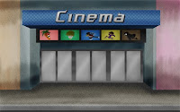 The external shot of the cinema is one of the more landmark shots of the movie, so I had to put a little bit of effort into how it looked. My main point of reference was the Odeon cinema on Birmingham New Street, albeit heavily simplified (ie. no Ben & Jerry's sign or neighbouring Gamestation). I still used a few key features, such as the glass doors, the overhanging...balcony whatsit (I don't know what you call them), and the rectangular movie posters. A few in jokes to be found there, from left to right; Mecha Carrot, the film featured in the movie, Curly Sam, one of my early characters, a stickman with a blonde afro, Wonchop, my personal character who I was planning to animate before hand, Sexual Harrassment Wigman, whom I've featured in the earlier film posters, and Hitmantis, the guy who I animated during Gamer Camp. One of the key things you'll notice is my reliance on Pattern Overlays, which helped speed up the process, although it looks a bit crap on the buildings.
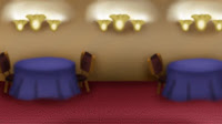
I kept the restaurant scenario fairly simple, generally using the flash animated parts as a reference to drawing out the tables, with the classic gaussian blur and Burn tools used to good effect. To make it look like I put some effort into it,I had a lil try at making the lights look decent, though they still look a little crap, the shadows look alright. One technique I tried out with the pattern on the carpet was to apply it to the layer (which Photoshop doesn't make easy if you just want to do it on one layer btw), and then use the Distort tool to give the carpet a bit of perspective.
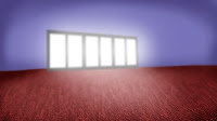 I kept the cinema interior fairly simple, as I was more or less approaching my limit, so there isn't really any big features like arcade games or ice cream parlours or whatnot. I did, however, manage to get a good lighting effect coming through the glass doors. One particularly neat tricked I learnt whilst doing this scene was to duplicate the carpet layer, apply a gaussian blur to it, and then used a gradient mask, giving the impression that the carpet is getting blurrier the farther away it is, adding to the perspective.
Finally, to add a little more girth to my presentation, I'll just add a little bit about my general animation process.
Unlike all the industry professionals and whatnot who draw out their storyboards on paper and then scan them to make some animatics, I draw my animatics straight into flash as it gives me a better sense of what to do with the timing (although that still tends to suck if I don't have any sound to work with at the beginning, years of collabs and Weebl songs have made me feeble =(.)
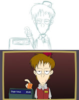 Above: Sketching, Below: Final
Well, I've hoped I've managed to write enough stuff to accompany the practical element of the thing and slip through the thing. Once I've tweaked it up a little, I'll release it on Youtube/Newgrounds/DeviantArt/etc. where I'm sure it's kudos will be overlooked by some videogame parody of sorts.
Chao.
And whilst we're onto backgrounds, here are some of the others I made for the animation.
 The external shot of the cinema is one of the more landmark shots of the movie, so I had to put a little bit of effort into how it looked. My main point of reference was the Odeon cinema on Birmingham New Street, albeit heavily simplified (ie. no Ben & Jerry's sign or neighbouring Gamestation). I still used a few key features, such as the glass doors, the overhanging...balcony whatsit (I don't know what you call them), and the rectangular movie posters. A few in jokes to be found there, from left to right; Mecha Carrot, the film featured in the movie, Curly Sam, one of my early characters, a stickman with a blonde afro, Wonchop, my personal character who I was planning to animate before hand, Sexual Harrassment Wigman, whom I've featured in the earlier film posters, and Hitmantis, the guy who I animated during Gamer Camp. One of the key things you'll notice is my reliance on Pattern Overlays, which helped speed up the process, although it looks a bit crap on the buildings.
I kept the restaurant scenario fairly simple, generally using the flash animated parts as a reference to drawing out the tables, with the classic gaussian blur and Burn tools used to good effect. To make it look like I put some effort into it,I had a lil try at making the lights look decent, though they still look a little crap, the shadows look alright. One technique I tried out with the pattern on the carpet was to apply it to the layer (which Photoshop doesn't make easy if you just want to do it on one layer btw), and then use the Distort tool to give the carpet a bit of perspective.
 I kept the cinema interior fairly simple, as I was more or less approaching my limit, so there isn't really any big features like arcade games or ice cream parlours or whatnot. I did, however, manage to get a good lighting effect coming through the glass doors. One particularly neat tricked I learnt whilst doing this scene was to duplicate the carpet layer, apply a gaussian blur to it, and then used a gradient mask, giving the impression that the carpet is getting blurrier the farther away it is, adding to the perspective.
Finally, to add a little more girth to my presentation, I'll just add a little bit about my general animation process.
Unlike all the industry professionals and whatnot who draw out their storyboards on paper and then scan them to make some animatics, I draw my animatics straight into flash as it gives me a better sense of what to do with the timing (although that still tends to suck if I don't have any sound to work with at the beginning, years of collabs and Weebl songs have made me feeble =(.)
 Above: Sketching, Below: Final
I draw the rough layout, be it as part of the animatic, or if I want to draw something pretty, using the brush tool in a light blue colour, which makes it easier to trace over (even if I don't, I can just turn it that colour later). Once that's done, starting on a new layer, I zoom into double what I draw the rough in (for this 1024x575 movie, I drew it at 200%) and draw over it with the black brush, being careful to smooth out and rough looking lines with the smooth tool. For any circles I draw, such as the eyes, a draw as good a circle I can, highlight it, and press the Straighten button to get a good round circle. I most points I try to keep the brush size consistent, though for some bits where drawing too far out leads to bad results, I zoom up again to get a better accuracy. Simply put, the smaller your guy is, the harder it is to get the details right.
Once I got the lineart done, I stick in my fills and such, et voila.
Once I got the lineart done, I stick in my fills and such, et voila.
Well, I've hoped I've managed to write enough stuff to accompany the practical element of the thing and slip through the thing. Once I've tweaked it up a little, I'll release it on Youtube/Newgrounds/DeviantArt/etc. where I'm sure it's kudos will be overlooked by some videogame parody of sorts.
Chao.
Tuesday, 5 January 2010
Sound Design
Long time no update, I know. December involved a lot of urgent commission work, semi-forced socialising and bloody puppy surveillance, so I haven't been able to get a lot done over the holiday. However, I'm pushing it in this final stretch of a week. Serves me bloody right for being too ambitious and going with 'super awesome student film shiznite' instead of simple TV stings and stuff. Hey, how was I supposed to know we'd be doing two of these specialist study things? >=U
Here's my current progress. That's another 3 and a half scenes to do in under a week. Eep!
Given the time restraints, I'm mostly going with flat shading, except for times where lighting is required, such as in the cinema.
Animation wise, I've gotten in the habit of converting my motion tweens into twos, so that it doesn't clash as much with the frame by frame animation, also done in twos. I do this by setting up the motion tween and applying the desired tween effect. I then highlight all the relevant frames and select 'convert to keyframes', since doing them individually can mess up the easing. Whilst they are still selected, I right click and select 'Remove Tween', removing the motion tween, and then I start removing every second keyframe. Et voila, twos.
One aspect I've been focusing on is the sound, a vital aspect for any silent protagonist film.
As far as setting the ambience goes, I've looked at sites like SoundDogs for relevant files, such as crowds and bus noise. I've also looked at Freeplaymusic.com for some royalty free music tracks to use.
For the background music in particular, to get a good acoustic effect, I edited the music files in a program called Goldwave. By using the Bandpass/Stop tool and selecting the 'Voice Hum and Hiss Filter', it helps give that low quality feel you get from stereo speakers and the like. I also used this for the movie dialogue. Why is Jeff Goldblum there, you ask? Well, why wouldn't there be Jeff Goldblum? There's a giant dooflip destroying the world, of course he'd be there.
My family watches a lot of Independance Day okay?
Of course, when it came to those sound effects I just can't find on the internet, I've had to record those myself using my recently purchased Samson C01U microphone. As a guy restricted to the groove his posterior has made in front of the laptop most of the time, I don't particularly have the luxury of going outside to get relevant things, so I've had to improvise. For example, the popcorn noises came from me scoffing a packet of Skips I had conveniently brought upstairs for my late lunch. I used a lil scrap of paper I had at arm's reach to perform the slight noises you get from the note rustling. When it came to the flowers bit, I was a bit stumped as there were very few things I could use to replicate dropping a bunch of flowers without buying a fresh pair and messing up the floor with them. Conveniently, Mum had this rather twiggy decoration dooflip downstairs that gave a satisfactory rattle, which made do quite well.
I tell you, once this is all done. I'm gonna kick back and settle down with hot british nannies wielding guns on their feet.
Here's my current progress. That's another 3 and a half scenes to do in under a week. Eep!
Given the time restraints, I'm mostly going with flat shading, except for times where lighting is required, such as in the cinema.
Animation wise, I've gotten in the habit of converting my motion tweens into twos, so that it doesn't clash as much with the frame by frame animation, also done in twos. I do this by setting up the motion tween and applying the desired tween effect. I then highlight all the relevant frames and select 'convert to keyframes', since doing them individually can mess up the easing. Whilst they are still selected, I right click and select 'Remove Tween', removing the motion tween, and then I start removing every second keyframe. Et voila, twos.
One aspect I've been focusing on is the sound, a vital aspect for any silent protagonist film.
As far as setting the ambience goes, I've looked at sites like SoundDogs for relevant files, such as crowds and bus noise. I've also looked at Freeplaymusic.com for some royalty free music tracks to use.
For the background music in particular, to get a good acoustic effect, I edited the music files in a program called Goldwave. By using the Bandpass/Stop tool and selecting the 'Voice Hum and Hiss Filter', it helps give that low quality feel you get from stereo speakers and the like. I also used this for the movie dialogue. Why is Jeff Goldblum there, you ask? Well, why wouldn't there be Jeff Goldblum? There's a giant dooflip destroying the world, of course he'd be there.
My family watches a lot of Independance Day okay?
Of course, when it came to those sound effects I just can't find on the internet, I've had to record those myself using my recently purchased Samson C01U microphone. As a guy restricted to the groove his posterior has made in front of the laptop most of the time, I don't particularly have the luxury of going outside to get relevant things, so I've had to improvise. For example, the popcorn noises came from me scoffing a packet of Skips I had conveniently brought upstairs for my late lunch. I used a lil scrap of paper I had at arm's reach to perform the slight noises you get from the note rustling. When it came to the flowers bit, I was a bit stumped as there were very few things I could use to replicate dropping a bunch of flowers without buying a fresh pair and messing up the floor with them. Conveniently, Mum had this rather twiggy decoration dooflip downstairs that gave a satisfactory rattle, which made do quite well.
I tell you, once this is all done. I'm gonna kick back and settle down with hot british nannies wielding guns on their feet.
Saturday, 5 December 2009
More concept artwork + some rough animation.
Here are a few more concept designs for Date for One. Due to a lack of time, I'll probably forgoe any further concepting and get cracking on the main thing.
 First up is the waiter of the restaurant who gets subjected to our main guy's demands. When it came to putting him in colour, I originally tried having the characters in a greyish outline, as opposed to the usual black. However, when it came to this guy, I had to make the jacket lighter than the outline, and it became a bit too light and dull looking. I'd like to say his design is influence by the stereotypical french waiter, but then no specific ones spring to mind. If I absolutely have to find an example to link him to. I'd suppose we could go with the dude from the recent Go Compare adverts.

Well okay then...
 Here we have the cinema salesman clerk (I dunno wtf you call these people). His design is influenced by one of my internet friends, MrSimon, with your stereotypical acne thrown into the mix. One issue I'm having is what colour to make his garb, since everything I pick seems to clash a bit.
 This guy's one of the people watching the movie our hero picks, and has to deal with some of his antics. This is more or less a charicature of myself, since I tend to look pretty neat wearing a scarf and I'm a procrastinate little bugger.
 Here we have the girl that our hero encounters at the end of the movie. I tend to keep forgetting what shape to make her head but oh well. I decided to go with a quiet shy type girl, and she kinda has elements of previous girls I have drawn before, such as one girl who is blonde and tends to wear blue, and another who is shy and wears a scarf. I've also got an affinity for those large bangs that cover one of the eyes, seen in a lot of anime and manga series.
 The movie that our character goes see is a monster flick that I decided to base on a character I thought of called Mecha Carrot. If I were to inevitably make him into its own seperate animation, he'd be one that hosts a gargantuan sized cooking show (trees for veggies, humans for stock, etc.) He initially had these giant mecha arms, but in the interests of time, I'm leaving those out. In the brief clip we'll see in the movie, he shoots down a couple of helicopters with his laser eyes, so I did a few sketches to get a feel of how they'd look. And an unrelated doodle of one of my old tutors who had grown a curious moustache. I've also gone and made a mock movie poster that will appear in the final movie, made using photoshop.
 Coming soon to a theatre near nowhere
Maybe more later, chao.
 First up is the waiter of the restaurant who gets subjected to our main guy's demands. When it came to putting him in colour, I originally tried having the characters in a greyish outline, as opposed to the usual black. However, when it came to this guy, I had to make the jacket lighter than the outline, and it became a bit too light and dull looking. I'd like to say his design is influence by the stereotypical french waiter, but then no specific ones spring to mind. If I absolutely have to find an example to link him to. I'd suppose we could go with the dude from the recent Go Compare adverts.
Well okay then...
 Here we have the cinema salesman clerk (I dunno wtf you call these people). His design is influenced by one of my internet friends, MrSimon, with your stereotypical acne thrown into the mix. One issue I'm having is what colour to make his garb, since everything I pick seems to clash a bit.
 This guy's one of the people watching the movie our hero picks, and has to deal with some of his antics. This is more or less a charicature of myself, since I tend to look pretty neat wearing a scarf and I'm a procrastinate little bugger.
 Here we have the girl that our hero encounters at the end of the movie. I tend to keep forgetting what shape to make her head but oh well. I decided to go with a quiet shy type girl, and she kinda has elements of previous girls I have drawn before, such as one girl who is blonde and tends to wear blue, and another who is shy and wears a scarf. I've also got an affinity for those large bangs that cover one of the eyes, seen in a lot of anime and manga series.
 The movie that our character goes see is a monster flick that I decided to base on a character I thought of called Mecha Carrot. If I were to inevitably make him into its own seperate animation, he'd be one that hosts a gargantuan sized cooking show (trees for veggies, humans for stock, etc.) He initially had these giant mecha arms, but in the interests of time, I'm leaving those out. In the brief clip we'll see in the movie, he shoots down a couple of helicopters with his laser eyes, so I did a few sketches to get a feel of how they'd look. And an unrelated doodle of one of my old tutors who had grown a curious moustache. I've also gone and made a mock movie poster that will appear in the final movie, made using photoshop.
 Coming soon to a theatre near nowhere
I've got a week to finish it so it ain't gonna be easy. I also have to type up an essay about how this links to traditional whosits and wotsits.
Here's the current rough animation status. I'm going to be generally making on the spot changes to what I have storyboard wise, since that's just the way I roll. For example, in the cinema scene, I added a little bit of the guy trying to decide what movie he wants to watch.
http://spamtheweb.com/ul/upload/051209/72717_DateForOne.php
I've also ordered myself a fancy new mic, complete with stand and noise reduction panel thingy so I can provide a few additional sounds to the dooflip.
Here's the current rough animation status. I'm going to be generally making on the spot changes to what I have storyboard wise, since that's just the way I roll. For example, in the cinema scene, I added a little bit of the guy trying to decide what movie he wants to watch.
http://spamtheweb.com/ul/upload/051209/72717_DateForOne.php
I've also ordered myself a fancy new mic, complete with stand and noise reduction panel thingy so I can provide a few additional sounds to the dooflip.
Maybe more later, chao.
Monday, 16 November 2009
Back in action
K, well I'm done sulking over the earlier mishaps and I'm slowly getting back to working on this. Which is probably a good idea, since I'm also currently participating in a 4 week Gamer Camp thingy, so yeah, best make the most of my free time.
I more or less finished up the storyboard (which may eventually get scanned...I don't have a scanner hooked up to this laptop so er.... yeah). I've revised some bits, such as the debate over whether the 'girlfriend' should have a plate of dinner at her table or not. I've also cut out a good chunk at the start, since I'm running short on time. Initially I had this whole 'preparation' build up thing, that also doubled as a title sequence, with credits imprinted on shampoo bottles and the title coming out of the drawer (think something along the lines of those mysteriously appearing text in games such as Grand Theft Auto IV or Splinter Cell Conviction.) A simple title card, however, will suffice the audience.

Right now I'm drawing up the characters digitally in Flash, to get their final look down. Starting with my still currently nameless dude right here. There I drew his body, 3 views of his head, a zoomed up head with some features and shading added to it, and another one using lineart and gradient fills, which I probably won't use since it'd take too long to animate, but it makes for good comparison. I then garnished it with a few oddbod poses and expressions, just to get a feel for how he'd be acting.
I decided to give the guy this curly hair look (see below posts for other haircuts) since I felt it would stand out more compared to all your generic scruffy people (one of my habits being I tend to draw stuff with lots of corners, etc.) and would look nice in animation. Since it's a rather modern day romcom, I decided to forgoe your typical tuxedo/bowtie combo and go with a nice shiny purple shirt. Namely cos my Dad used to wear a purple shirt and it kinda fit the dork nature. As for the eyes, as a change of pace from my usual Cartoon Network sized monstrosities, I'd go with nice small circular ones. A recent example of me using this would be my September animation, "Arrgh Idol".
 Watch Arrgh Idol here.
The main question is the type of animation style I should use. Frame by frame (traditional) or motion tweening. Personally, I want this to look good, and want to go for that fbf look, but again, it's one of those things that are time permitting. Then there's the matter of how to go about the backgrounds. May need to get myself a decent camera and get some shots that I can trace over in Photoshop or Art Rage or something. As for music, I've got a fair few contacts I can ask around for some musical accompaniment. Who I ask depends on how the animation (or at least the animatic) looks. Oh yeah, and apparently I need to write a script or something. >_>
I more or less finished up the storyboard (which may eventually get scanned...I don't have a scanner hooked up to this laptop so er.... yeah). I've revised some bits, such as the debate over whether the 'girlfriend' should have a plate of dinner at her table or not. I've also cut out a good chunk at the start, since I'm running short on time. Initially I had this whole 'preparation' build up thing, that also doubled as a title sequence, with credits imprinted on shampoo bottles and the title coming out of the drawer (think something along the lines of those mysteriously appearing text in games such as Grand Theft Auto IV or Splinter Cell Conviction.) A simple title card, however, will suffice the audience.

Right now I'm drawing up the characters digitally in Flash, to get their final look down. Starting with my still currently nameless dude right here. There I drew his body, 3 views of his head, a zoomed up head with some features and shading added to it, and another one using lineart and gradient fills, which I probably won't use since it'd take too long to animate, but it makes for good comparison. I then garnished it with a few oddbod poses and expressions, just to get a feel for how he'd be acting.
I decided to give the guy this curly hair look (see below posts for other haircuts) since I felt it would stand out more compared to all your generic scruffy people (one of my habits being I tend to draw stuff with lots of corners, etc.) and would look nice in animation. Since it's a rather modern day romcom, I decided to forgoe your typical tuxedo/bowtie combo and go with a nice shiny purple shirt. Namely cos my Dad used to wear a purple shirt and it kinda fit the dork nature. As for the eyes, as a change of pace from my usual Cartoon Network sized monstrosities, I'd go with nice small circular ones. A recent example of me using this would be my September animation, "Arrgh Idol".
Watch Arrgh Idol here.The main question is the type of animation style I should use. Frame by frame (traditional) or motion tweening. Personally, I want this to look good, and want to go for that fbf look, but again, it's one of those things that are time permitting. Then there's the matter of how to go about the backgrounds. May need to get myself a decent camera and get some shots that I can trace over in Photoshop or Art Rage or something. As for music, I've got a fair few contacts I can ask around for some musical accompaniment. Who I ask depends on how the animation (or at least the animatic) looks. Oh yeah, and apparently I need to write a script or something. >_>
Thursday, 29 October 2009
Why I haven't really updated much
Project's kinda hit an awkward standstill based on some critique last week. I dunno quite how to explain it, but thefirst 40 seconds of this Um Jammer Lammy video should give some explaination. Think of Parappa (the hat wearing dog) as me, PJ (the bear) as my tutor, and the guitar as my plot.
Yup. God damn bear. =(
Basically, he wants me to take out any reference to the fact the main character's going on a date by himself until the end of the movie, but I cannot in any way think of any way that's gonna work. The fact we can see there's nobody there provides pretty much the entire basis for the visual gags in this thing. Apparently, I'm supposed to compare it to films like Shallow Hal and Fight Club, but the more I think about it, the more I believe this project has very little to do with those things, in the way their perception of vision is implimented. If I were to compare it to anything, I'd go with sexually depraved mime, except his girlfriend's the only thing that's invisible.
So yeah, I'm currently stuck in a slump with a half-finished storyboard. I can't think of any reason to go with his idea, though the entire class is supporting it, meaning there might be a bit of potential grading damage if I stick with the idea that makes sense.
It's generally just....urgggh.
Yup. God damn bear. =(
Basically, he wants me to take out any reference to the fact the main character's going on a date by himself until the end of the movie, but I cannot in any way think of any way that's gonna work. The fact we can see there's nobody there provides pretty much the entire basis for the visual gags in this thing. Apparently, I'm supposed to compare it to films like Shallow Hal and Fight Club, but the more I think about it, the more I believe this project has very little to do with those things, in the way their perception of vision is implimented. If I were to compare it to anything, I'd go with sexually depraved mime, except his girlfriend's the only thing that's invisible.
So yeah, I'm currently stuck in a slump with a half-finished storyboard. I can't think of any reason to go with his idea, though the entire class is supporting it, meaning there might be a bit of potential grading damage if I stick with the idea that makes sense.
It's generally just....urgggh.
Tuesday, 13 October 2009
Date for One - Character Designment
OK, new uni year's here, so time to pick up this blog again.
Since I last posted, it was recently decided I should shy away from the whole Wonchop idea for now, since it's something for more later down the line.
So, I'm proceeding with the idea of Date for One. Step one is to decide on a firm character design.
Initially, I started off with the rather bulbous looking style from the posts below. After generally nagging from tutors about how I stick to specific styles, I tried some different methods. Somehow Tonic Trouble, a game that came with our PC billions of years ago, came into my head, and I tried experimenting with drawing long heads and applying characters to that.


It looked particularly interesting, and showed a fair bit more expression than the last design, so I decided to go with it further, tweaking it with different hairstyles, and eye shapes.


Some various attempts at the style, including one of the more amusing aspects of my idea.


The eyes eventually got smaller and more rounded.

Various designs lined up, including the old design, all in their pants.
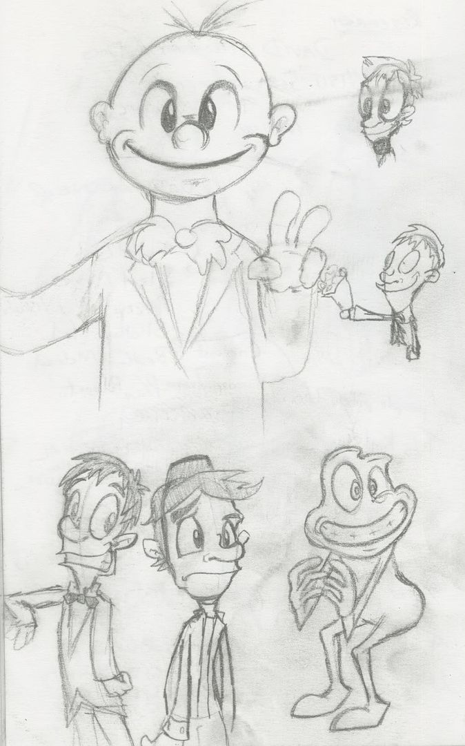
 Some designs for the other characters who may show up during the toon.
Since I last posted, it was recently decided I should shy away from the whole Wonchop idea for now, since it's something for more later down the line.
So, I'm proceeding with the idea of Date for One. Step one is to decide on a firm character design.
Initially, I started off with the rather bulbous looking style from the posts below. After generally nagging from tutors about how I stick to specific styles, I tried some different methods. Somehow Tonic Trouble, a game that came with our PC billions of years ago, came into my head, and I tried experimenting with drawing long heads and applying characters to that.
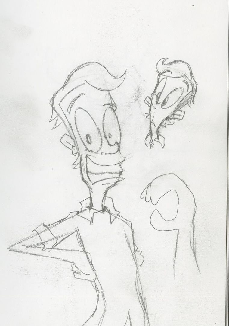

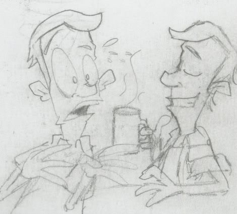
It looked particularly interesting, and showed a fair bit more expression than the last design, so I decided to go with it further, tweaking it with different hairstyles, and eye shapes.
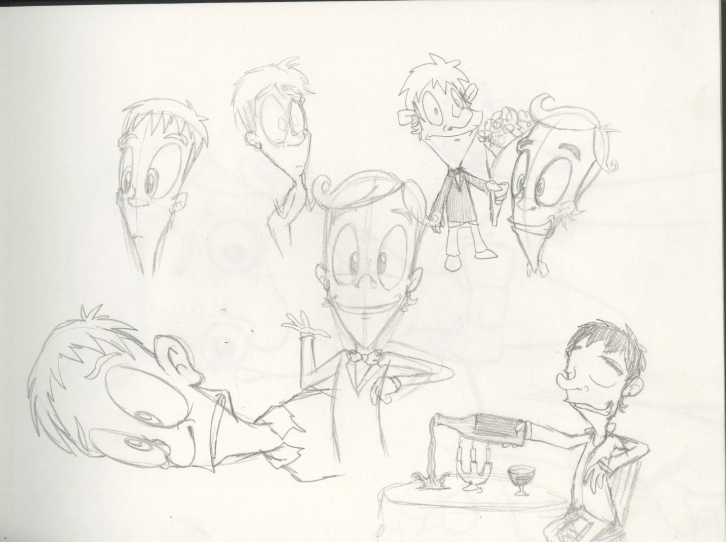
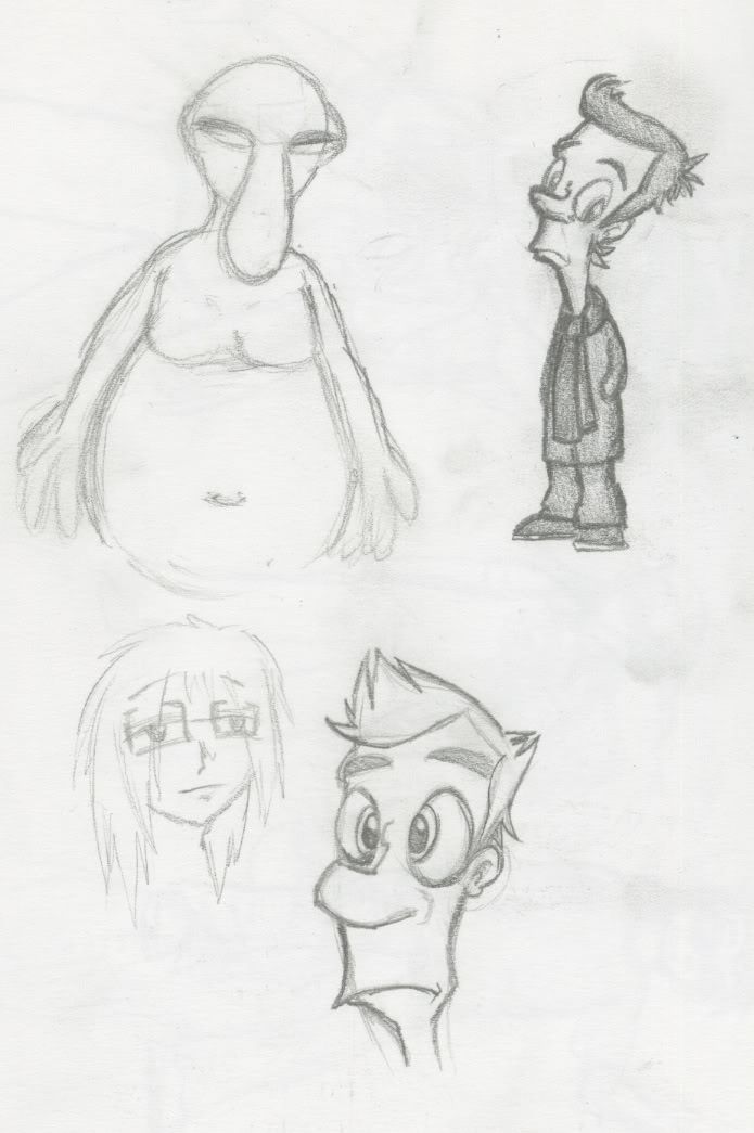
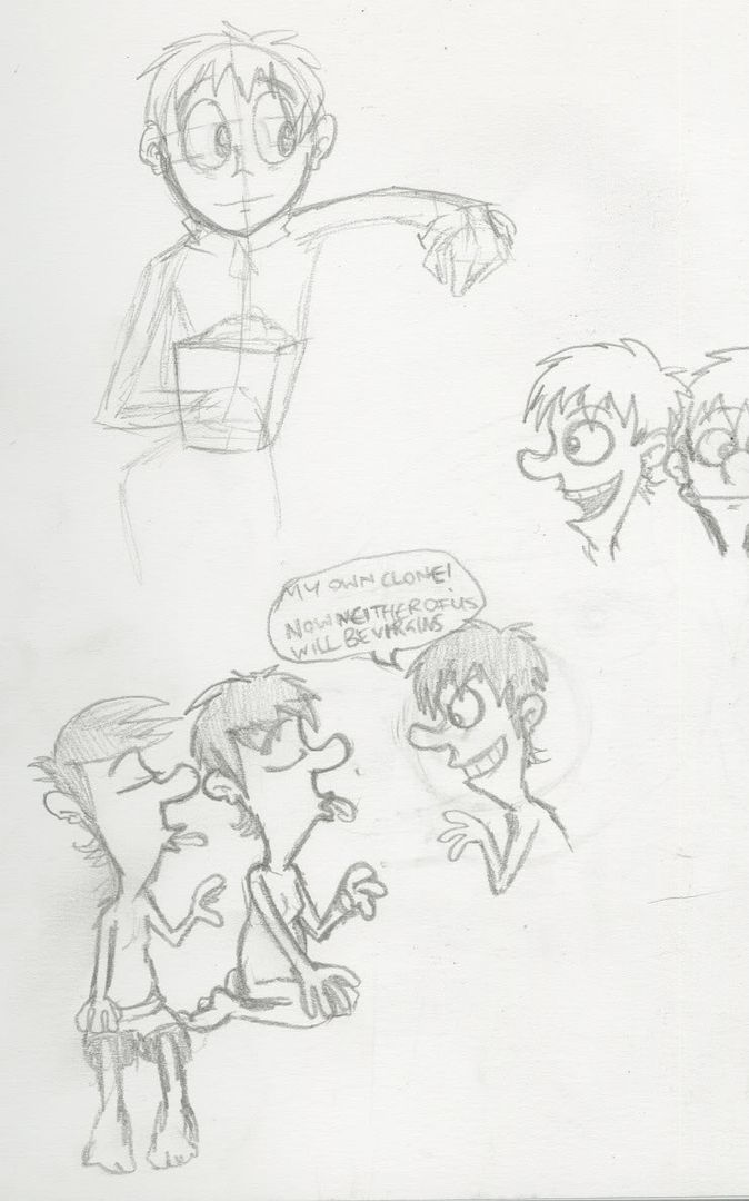
Some various attempts at the style, including one of the more amusing aspects of my idea.
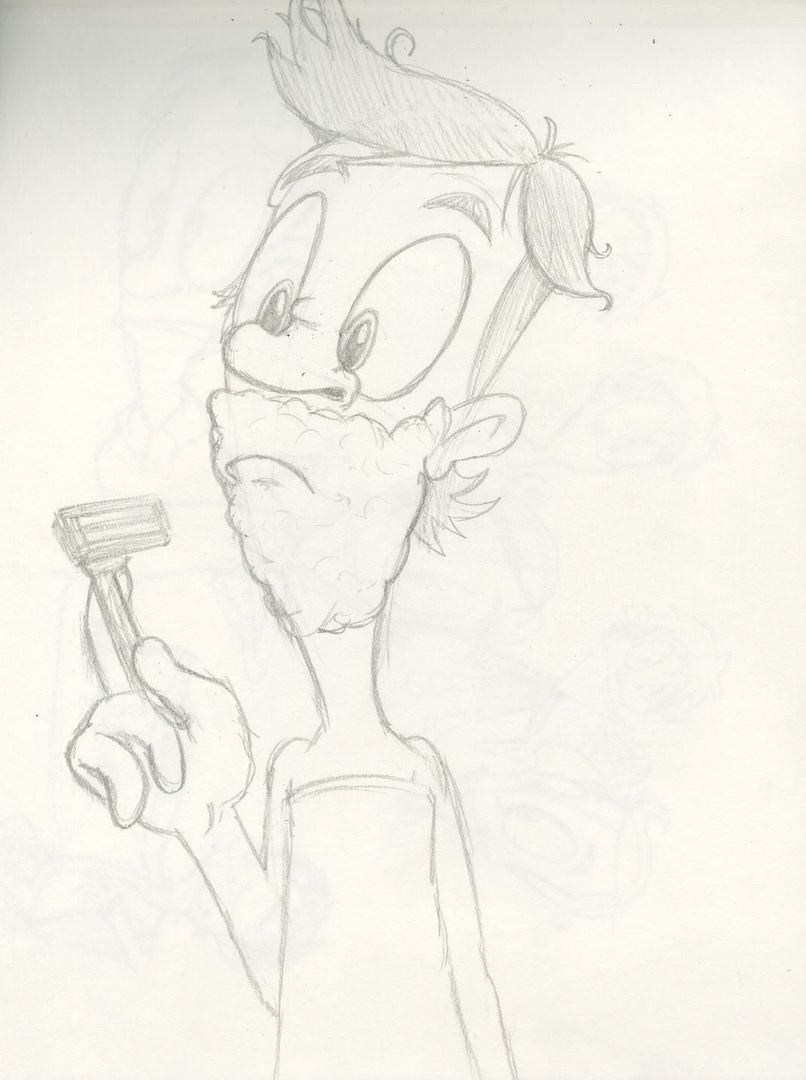

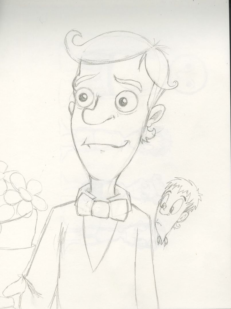
The eyes eventually got smaller and more rounded.
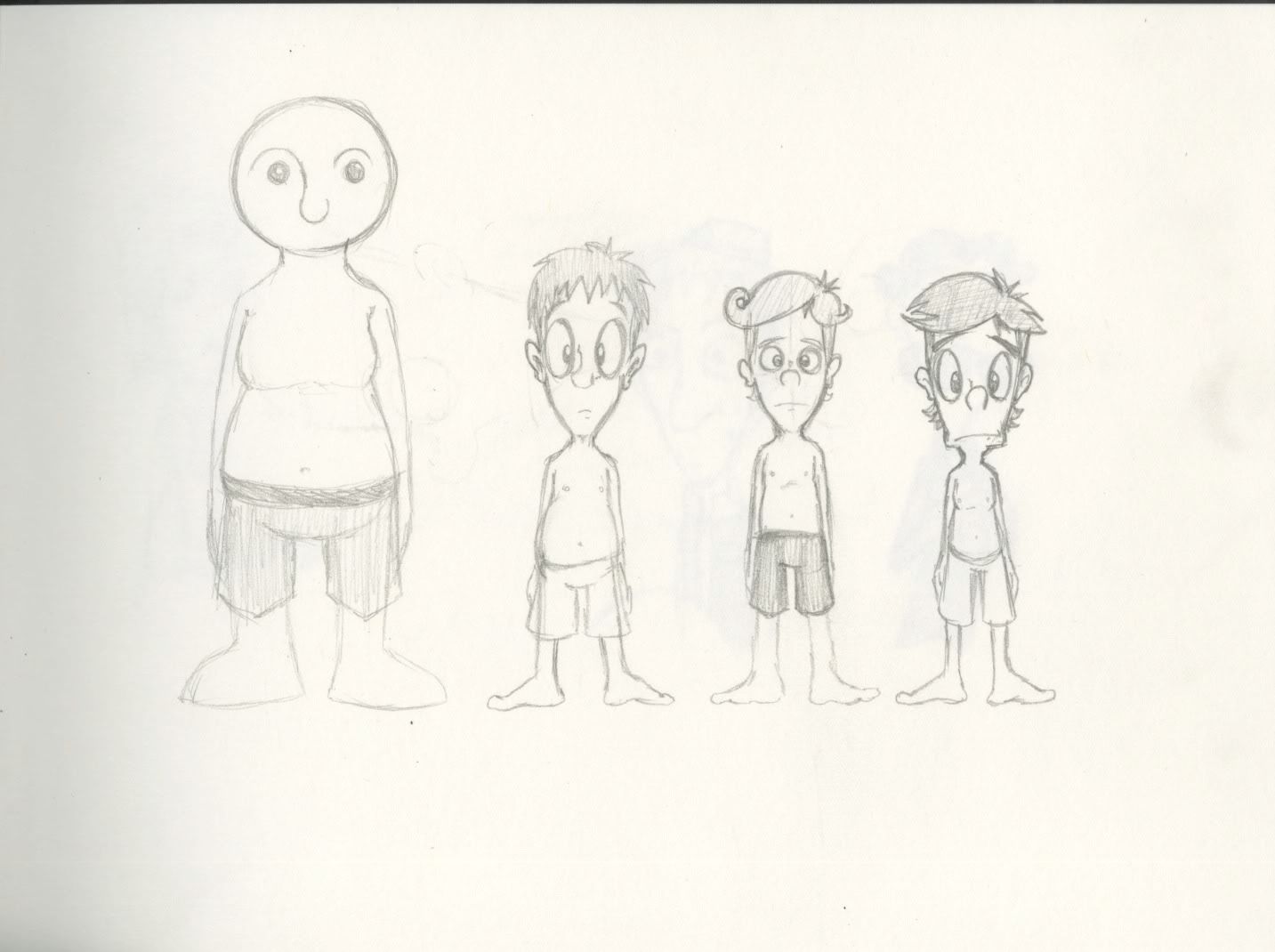
Various designs lined up, including the old design, all in their pants.
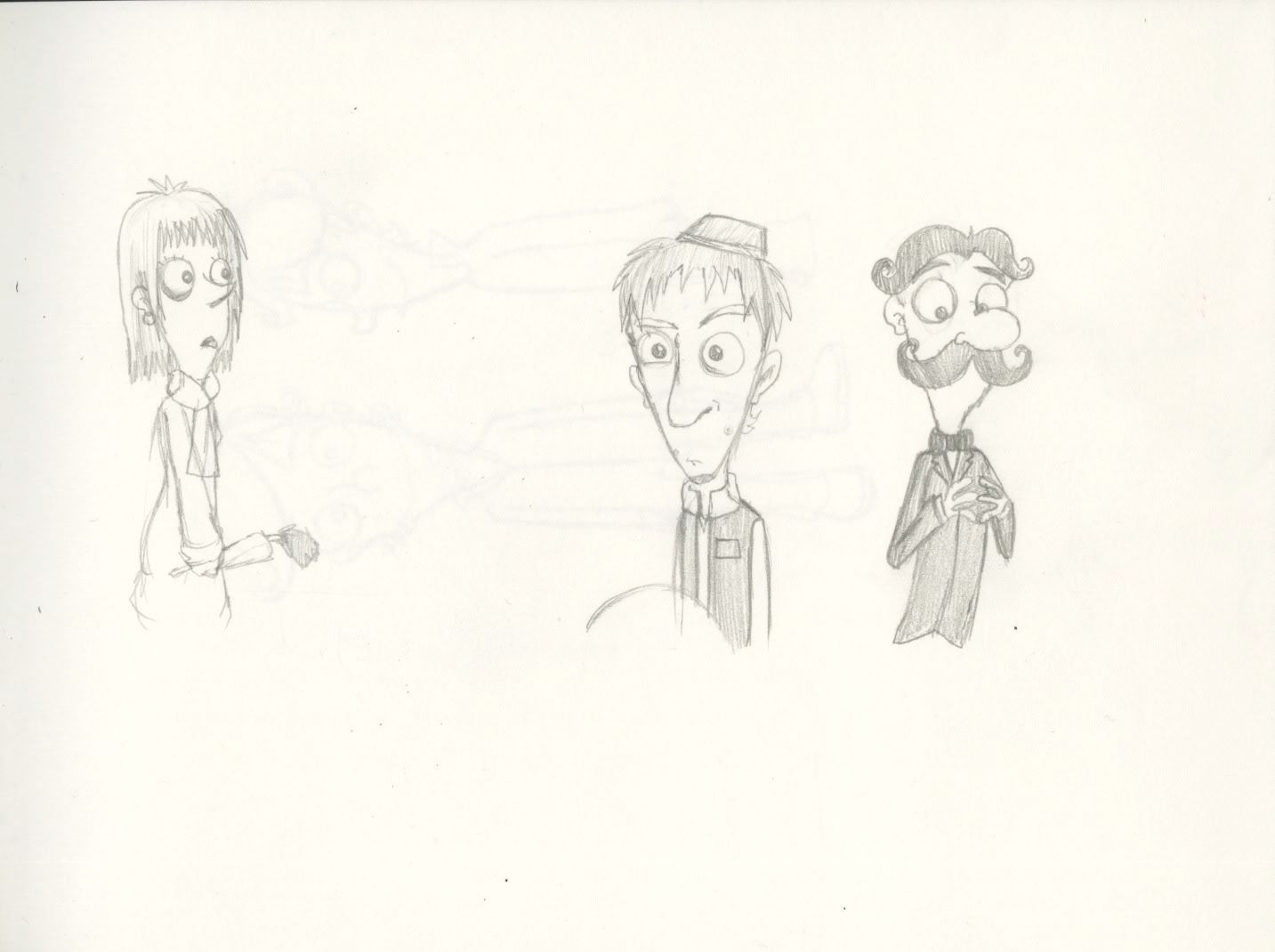
So yeah, much as I hoped to be a bit more experimental with how I went about my animation this year, the fact we're doing two projects lasting about 8 or so weeks each instead of one big one with months of production, it's same ol flash again.
FFFFFFFFFFFFFFFF
Now I need to try and get an animatic done, and maybe do some of this 'research' stuff I apparently have to do to make me sound cool.
Ps. Blogger Image Uploader, you still fail bucketloads
FFFFFFFFFFFFFFFF
Now I need to try and get an animatic done, and maybe do some of this 'research' stuff I apparently have to do to make me sound cool.
Ps. Blogger Image Uploader, you still fail bucketloads
Wednesday, 17 June 2009
Some character art
A few pictures to round off my RVJ work. Apologies for the quality.
Here's one of Date for One, which should give a good explanation of the general plot.
Here's one of Date for One, which should give a good explanation of the general plot.

And here's some character sketches for Wonchop.


Sunday, 31 May 2009
Pre Production for Specialist Animation


 Some sketches drawn in preparation for my final project next year.
I'm mostly juggling with two ideas at the moment.
One is something involving this big fat guy.
The other is a pilot of sorts for my Wonchop series, which I've been meaning to do something with for ages.
It is also totally littered with random doodles of Wallace and various videogame characters.

Also included is notes from a talk from The Brothers McLeod, I suck at notes though.

Subscribe to:
Posts (Atom)